Have you ever started to read a book, and on the first page–before you’ve engaged the actual content–you immediately get a bad feeling and can’t take the book seriously? And sometimes you can’t even explain why?
This is the impact of the book’s layout (sometimes called typesetting or interior design).
Book layout is one of those things that most people never notice…unless it’s wrong.
Despite how simple it seems (or perhaps because of it), book layout is one of the major factors that separates amateurish books from professional ones.
I will describe how to design both print and ebook, because they are very different formats, and must be done differently.
Some people refer to PDFs that you download and view on a screen as “ebooks.” That is not what we’re talking about. An ebook in this case is a unique format—typically an EPUB or MOBI—that is downloaded and read with a specialized device or software, such as a Kindle.
Interior Design Is Hard
Interior layout is easy to dismiss. It’s just the formatting of words on a page. Google Docs does that automatically. What’s the big deal, right?
Just like cover design, what seems easy is actually very difficult. In fact, working with type is considered the most difficult thing to do in design. The first thing to realize is that there’s a lot more that goes into designing the interior of a book than you might expect. These are just some of the decisions that must be made:
- trim size (as explained above)
- color vs. black and white
- other physical considerations (paperback vs. hardcover, paper stock, etc.)
- font selection
- page margins
- spacing decisions
- artistic direction and design elements
- sidebars (if any)
- if/how you want to incorporate illustrations, photography or other graphics
There are also all the more nerdy publishing details that your proofreader should have caught but likely didn’t, like making sure you’re using the right dashes in the right places (hyphens, em and en dashes all have distinct uses). The same goes for quotation marks (straight vs. curly vs. foot/inch marks—all different things), mathematical symbols (× vs. x) and nearly every other symbol you can (but won’t) think of.
For example:
Did you know that certain fonts and justification styles can give your readers headaches? Your interior designer does.
Did you know that breaking a paragraph improperly, leaving just a partial line on the next page can interrupt the mental engagement readers have with your material? These lonely fragments are called “widows” and your interior designer knows how to correct them.
But, truthfully, that’s only a small part of the problem. The main reason that it’s so complicated and expensive is that nobody wants to do it.
Book interior formatting is hard, tiring work, and requires a lot of hours from someone with at least a strong baseline of design skills. Most designers went into the field because they love working on beautiful, creative projects. Interior print layout has those elements, sure—but also demands a lot of precision and “boring” practical considerations that designers don’t always like to be constrained by (not unlike, say, industrial design).
Should I Skip a Print Version Entirely?
Print books are a lot of work. So why should you even do them?
The reason is actually that you should do them precisely because they’re a lot of work. The book market is flooded with thousands of new authors every day. As you know, it can be difficult to stand out.
Because of how challenging doing a good print book is, and how embarrassingly ugly it can be when done wrong, a lot of new authors are veering away from the challenge and publishing in ebook format only. In many circles, this has started to be a dividing line between books that should be taken seriously, and books that shouldn’t.
Many people see ebooks as “not real books” and dismiss them as less impressive than paperbacks. If you are doing a business book, then this is crucial. You can’t really hand out (or sell) an ebook at a conference or speaking engagement.
Creating a high quality paperback or hardcover version is one of the most powerful ways to make sure your book is taken seriously and seen as a “real” book. We wouldn’t skip this step if credibility is a key goal of yours.
Designing the Print Interior
What Should a Good Interior Layout Look Like?
This is not an easy question to answer. Like we said earlier, very few people notice the interior layout–unless it’s wrong, then it’s a huge problem.
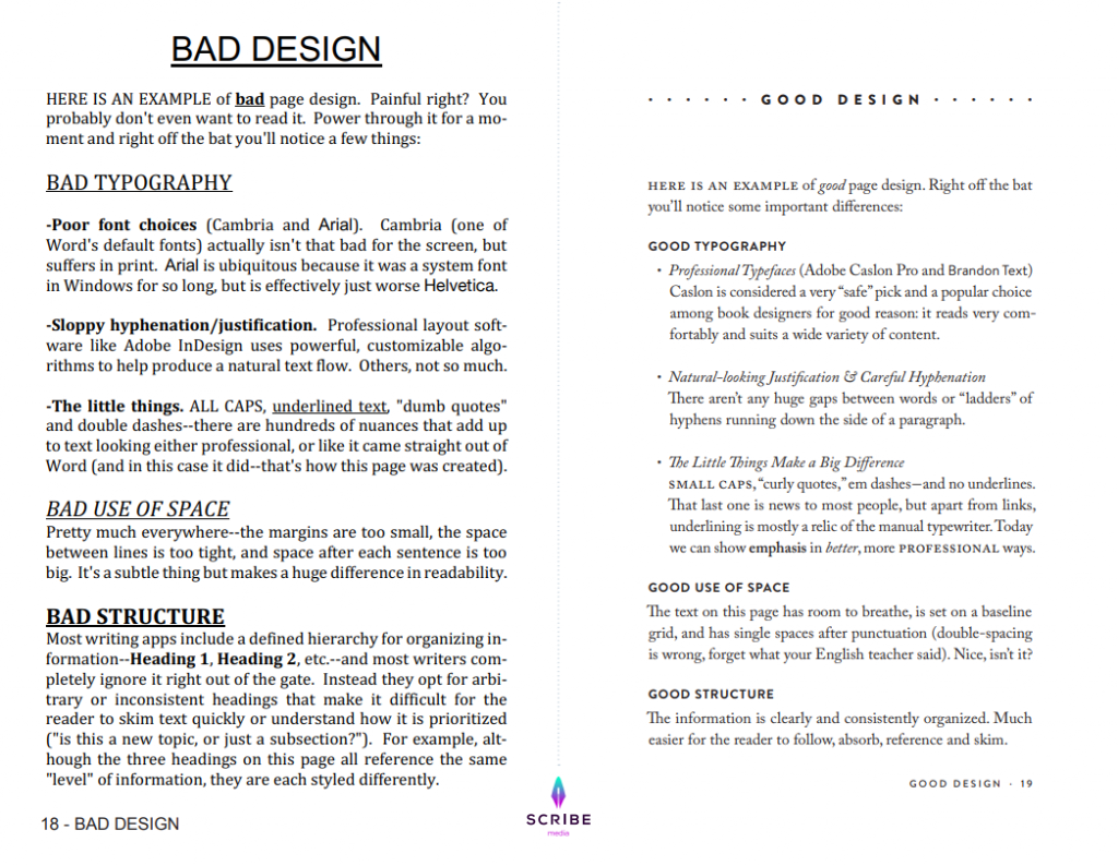
Below is an image with major elements of interior design, and then an explanation of some of them. I’m putting in a picture and explaining them, not because I expect you to learn them, but for two other reasons:
1. So when you hire a professional interior designer to layout your book for you (which we highly recommend), you have a list of things you can discuss with them.
2. So you know what good versus bad looks like.
Major Interior Design Elements:
Page Margins
One of the main elements in all design is what’s called “negative space.” That is the space with nothing in it. For your book interior, that is margins between the words and the edge of the page.
Look at the Bad Design use of margins, versus the Good Design use. You see how, without even knowing why, each of these margins are important, and serve a purpose?
The outside margins give room for the reader to hold the book without covering the words.
The inside margin makes sure the text doesn’t slip into the binding area, and become hard to read.
The top margin is for the name of the book and authors name, as well as the page number.
The bottom margin provides a pillow of white space that balances the rest of the page.
Traditionally, the four margins are close in size and around a half inch, though the inside margin is usually 25-50% larger than the other three
Typography
Now, look at the typography and font choices. Fonts and type is an incredibly complex field, and very important to books. Professional books are traditionally set in fonts like Adobe Caslon Pro and Brandon Text.
The font you choose must be clearly legible, and has italics, semibold, bold and small caps all included and well done. A comfortable size for most books is 11pt font.
This is clearly visible in the diagram. The Bad Design font hurts to read, whereas the Good Design font feels calm and relaxing.
Titles & Headers
It is very important that the headers lead to an easy to read flow of words on the page. You can see the difference again in the Bad Design versus the Good Design page. The Bad Design headings on the page feel crowded and confused. The good design feels spaced and structured.
Head & Feet
Look at the bottom of the page, where the page number is next to the chapter title. Which looks better? Very clearly the Good Design does. It’s smaller, the dot looks better than a dash, and the font choices make better sense.
Trim Size
There aren’t any hard and fast rules around trim size, but there are general trends. Trim sizes are always measured in inches, with the horizontal measurement first, then the vertical.
The most common book size is 6 ✕ 9. It works for books of almost any style and is generally the industry standard.
At Scribe Media, we typically use 5.5 ✕ 8.5. This slightly smaller size tends to be more common with business books. There are a lot of books that are 5 ✕ 8 as well, but I’d consider that the lower limit before the book starts looking awkwardly small.
How to Create Your Print Layout
Like most steps in this process, you have two options: you can do it yourself, or you can hire someone more talented than you who does it professionally.
DIY
As we’ve already discussed, doing a cheap interior can completely change the perception of your book. But, if it’s the only option that works for you financially, there are some ways to do it yourself. If you really want to go all out, you need to learn Adobe InDesign, alongside the fundamentals of professional typography and design. To be clear: Don’t do that, if you value your time at greater than $0.
Instead, we recommend a far more user-friendly application called Vellum. Vellum isn’t free, and it’s Mac-only, but it’s the best tool available for Do-It-Yourselfers, and allows you to generate both print and ebook files.
The print layout design quality is only so-so, but still better than you’d be able to do on your own or by hiring a bottom-tier designer. It’s like the difference between editing a photo in Instagram vs. Photoshop. A beginner will be able to get an ok result from Instagram quickly. Photoshop is far more powerful, and a professional will be able to get a much better result from it, but they had to invest a lot of time (and money) to get to that level.
If you’re going to hire a book designer–which you should–there are basically three options:
Cheap
There are people offering layout services on Fiverr. Bookalope is another. Upwork is another.
As we described earlier in the chapter, the quality of these designs is really low. It’s easy to delude yourself when you’re looking at a computer screen to think that the PDF looks good, but we’ve tested this path enough times to know better.
Only use the cheap options if you’re okay with the book not looking entirely professional. We’d honestly recommend going the DIY route as a better alternative to hiring this quality of designer—that’s how bad it usually turns out.
Middle Route
There are some decent layout people on Reedsy and similar websites. This bracket often contains graphic designers who are “moonlighting” with layout work and don’t necessarily have a lot of specialized experience in book design, but you can find some people who will do a solid enough job. Careful though: do not assume you’ll also get a quality ebook conversion out of the deal, as many graphic designers simply lack the expertise.
Expensive Route
The other alternative is to hire a real pro. More than any other part of the book creation process, except maybe editing, there’s a huge gap between good interior layout designers and mediocre ones. If you hire a bad editor, they’re worse than useless. If you hire a great editor, they can completely transform your book. Same goes with interior layout.
The problem with the expensive freelancers in this space isn’t their quality; the quality is good. The problem is the price and the turnaround time.
Because they’re in an industry with so little competition, they’re able to move slowly and charge a lot. But if you just care about someone doing a great job, the few freelancers you can find here do excellent work.
Designing the eBook
Compared to the horror of designing your print interior, designing an ebook is actually pretty straightforward. Unlike the manual work and design aesthetic that need to go into a print book, creating ebooks is mostly coding work and a lot of it is automated. The cost is lower, and the results are more consistent.
Understanding eBook File Formats
There are two standard ebook file formats that you’ll see. EPUB (book.epub) is the universal standard, and is used by Apple iBook, Nook, Kobo, and most other ebook retailers. These files are a little more customizable, have a little more flexibility for design, and are frankly just easier to use.
MOBI files (book.mobi) are for Amazon Kindle. Because Amazon is the big player in the space, they are able to set their own standards that are different from anyone else’s. Mobi files can be a little more complicated to edit, but they’re crucial, as Amazon will be where the vast majority of your books are sold.
UPDATE: Amazon announced that starting June 28, 2021, they will no longer support files in MOBI, PRC, or AZK formats when publishing new reflowable eBooks or updating the content for previously published eBooks. Instead, they ask publishers to use EPUB, KPF (Kindle Create files), or DOC/DOCX (Microsoft Word files) files for reflowable eBooks. MOBI files are still accepted for fixed-layout eBooks.You don’t need to take any action for reflowable eBooks already published unless you are updating the eBook files.
How to Create Your eBook Layout
Like most steps in this process, you have two options: you can do it yourself, or you can hire someone.
We’re just going to be blunt about this: unless you decided to go the Vellum route described earlier, don’t do it yourself.
Steer clear of any “automated” ebook conversions that involve uploading a PDF or Word file. Ironically, Amazon accepts these formats and will attempt to create a Kindle file from them, but the results are never good.
Unlike with print books, the cheap ebook designers do a better job than you will, so it’s not worth messing with. As with some of the other design elements, there are three places we’d turn for varying qualities of ebook.
Fiverr
As we discussed, Fiverr is a marketplace of freelancers offering their services, often at low rates. Obviously, no matter what you’re getting, it isn’t going to be of the highest quality, but with ebooks, they’re actually passable.
I wouldn’t recommend them to an author doing a professional business book, or for a book with a lot of hierarchy and headers (you should go through in Word and tag the headers properly in advance, because a Fiverr designer won’t get them right), but for authors with a seriously tight budget, it’s an option.
Upwork
Upwork is a good middle option. You can find pretty cheap talent and, if you look hard enough, pretty high quality people. Especially for something like ebook design—which isn’t overly complicated—finding someone with a lot of experience, great reviews, and some good examples of past work is usually enough to ensure success.
Professionals
The final option is to work with a firm that’s really professional. The challenge here is that a lot of the companies that look professional are really just fancy middlemen between you and cheaper, overseas labor. Don’t mistake a high price tag for professionalism.
If you don’t want to mess around or waste any time and you just want it done right without the back-and-forth, this is probably your best option.