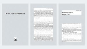
Have you ever picked up a book, and before you’ve even gotten to the second page, you set it down? Not because the content is bad, but just because it gives you a bad feeling?
It’s probably because the book had bad typesetting.
When humans read, their minds consciously process the book’s content.
Readers also subconsciously process visual information. Can you quickly scan the page? Is the chapter title eye-catching? Is the body text too tiny or large?
Basically, is the book readable?
As strange as it sounds, all those small, subconscious factors have an important effect on how people will perceive a book.
Typesetting is one of those things that people never notice…until it’s wrong.
It may seem unfair for you to spend so much time writing a book, only to have a reader dismiss it for something like font size.
But it happens all the time, and typesetting is one of the major factors that separates amateurish books from professional ones.
This post will teach you how to distinguish between good and bad typesetting, give you some guidelines for DIY typesetting, and explain how to find a good professional designer.
What Is Typesetting?
Typesetting is the process of arranging physical or digital type—the letters, symbols, and glyphs that make up a book—onto a page so it’s print-ready. This part of the publishing process comes after the manuscript has been edited and before printing.
A typesetter is responsible for choosing margin size, fonts, chapter styles, how large section breaks are, where illustrations go, what size subheadings are, and so on.
Essentially, they decide what page layout will be best for the reader.
Typesetting seems simple. It’s just making words look neat on a page. Microsoft Word does that automatically. What’s the big deal, right?
It may seem basic, but it’s not. Actually, typesetting is one of the hardest parts of graphic design.
Certain fonts and paragraph styles can give your readers headaches. No, literally—actual, physical headaches.
Breaking a paragraph in the wrong place can interrupt a reader’s mental flow.
There’s much more to typesetting than most people know.
Don’t confuse typesetting with typography. Typography is the art of arranging text so it’s visually appealing.
Typesetting involves arranging text so it adheres to grammatical rules. For example, typesetters have to figure out what to do if there’s a misplaced em-dash or a single word that carries over to a new line.
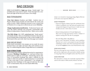
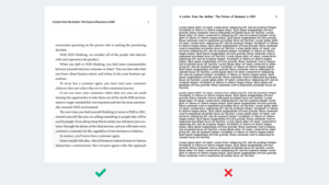
Examples of Good and Bad Typesetting
Like I mentioned earlier, typesetting is one of those things that very few people notice–unless it’s done poorly.
Below is an image highlighting both good and bad versions of key interior layout elements.
As you can see, everything from typography and page margins to trim size and headers can impact the way readers perceive your book.
DIY Typesetting vs. Professional Typesetting Services
Like most steps in the book publishing process, you have two options: do it yourself or hire someone more talented to do it professionally.
Do It Yourself
If you go the DIY route, you have two tools at your disposal: a premade book template or typesetting software.
We don’t recommend using a template. Every book has unique typesetting issues that the template won’t address.
At best, using a template means you’ll still have to correct each page manually. At worst, you’ll end up with a cheap interior that reflects poorly on your book (and you).
It’s better to use typesetting software, which offers more flexibility with your layouts (more on that in a minute).
Remember, though, time is money. And good typesetting takes time, even if you use specially designed software.
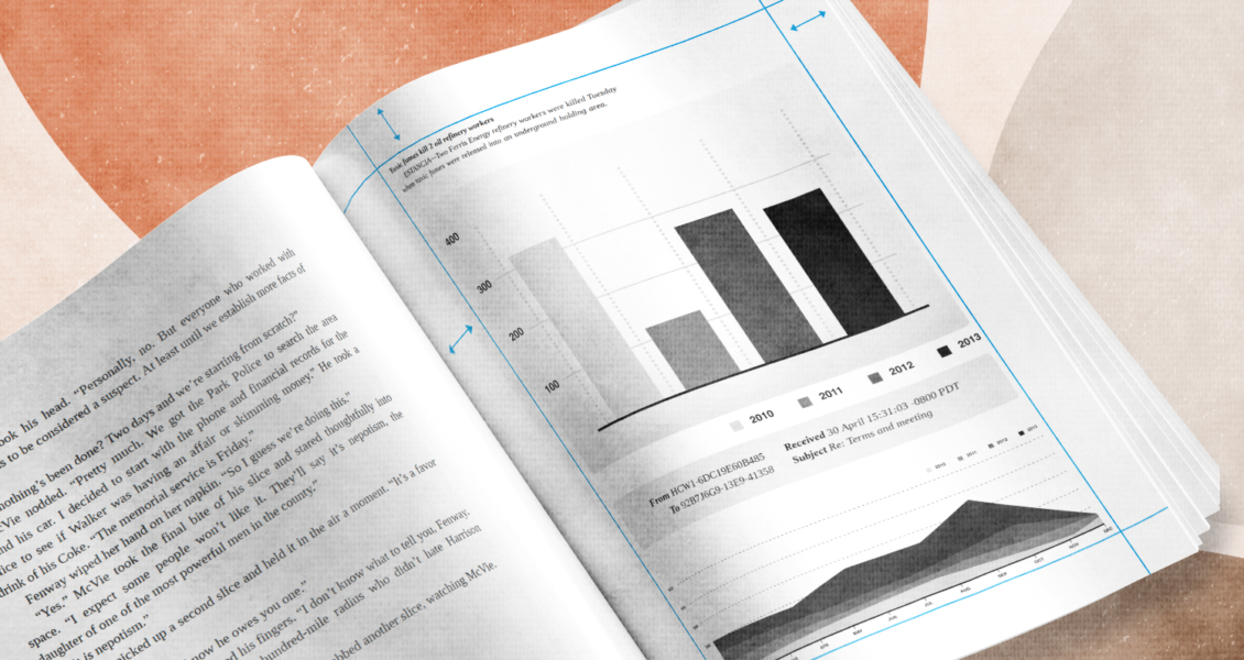
Also, the more complicated the typesetting, the more chances you have to make mistakes. If your book has challenging typesetting components like bullet points, charts, illustrations, sidebars, or graphics, be prepared to spend a lot of time learning and fine-tuning.
If you have the financial resources, you’re probably better off hiring a professional.
Cheap Professionals
Freelancers on Upwork, Fiverr, and Bookalope offer typesetting at a really low price. Generally, though, the quality of their work is terrible.
On your computer screen, the PDF might look passable, but when it’s printed, it probably won’t look right. You are getting what you pay for: not much.
The cheap options will make your book look unprofessional.
Instead of hiring a low-quality designer, it’s probably better to do it yourself. That’s how bad it usually turns out.
Mid-Range Professionals
This level includes a lot of graphic designers taking freelance work with layouts. They might be trained designers, but they often don’t have a lot of experience specifically with typesetting.
You can still find some people who will do a solid enough job. Check out Reedsy and similar websites to find designers in this price range.
Expensive Professionals
Your last option is to hire a professional. It’s a good investment because there is a big difference between good typesetting and middle-of-the-road design.
With design, you often get what you pay for. A professional will give you a high-quality result.
Here’s the catch: it will cost a lot, and you’ll probably have a long turnaround time.
How to Typeset a Book Yourself
Best Typesetting Software
To do a really professional job, you would need to learn the basics of professional design, plus the ins-and-outs of Adobe InDesign.
Don’t do it. Your time is more valuable.
If you really want to do-it-yourself, we recommend an application called Vellum. You can use it to create eBooks and print versions.
It’s not going to be perfect, but it’s a better option than trying to do everything entirely on your own or hiring a cheap designer.
Think of it like the difference between GarageBand and the software that professional sound engineers use. A beginner might be able to make a decent song on GarageBand, but it won’t sound as good as songs a professional could make with more sophisticated tools.
It takes a lot of time and money to get really good at typesetting.
Other typesetting programs besides Adobe InDesign and Vellum include:
- Reedsy Book Editor
- Draft2Digital
- Bookwright by Blurb
These typesetting programs are either too limited compared to Vellum or too complicated to use effectively. If you’re really set on DIY typesetting, we would not recommend these tools.
Top 4 Rules for Typesetting Books
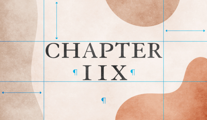
1. Leave Negative Space
Some of the most important parts of a page are the parts with nothing in them: the margins between the words and the edge of the page.
That’s called “negative space.”
Outside margins give the reader room to hold a book without covering the words.
Inside margins make sure the text doesn’t get too close to the binding, which would make it hard to read.
The bottom margin and top margin need room for the book title, page number, author name, or current section title. The extra white space balances the page.
Typically, page margins are around half an inch, although the inside margin is usually 25-50 percent larger than the other three.
Line spacing and section breaks are also important for readability. Your paragraphs should never feel crowded or confused.
Even the negative space between characters matters. (It’s called kerning.) If you have too much space, the text will be hard to read. If you have too little, it will seem cramped and may cause eye strain.
The goal is to give the reader’s eye just enough room to move quickly and comfortably.
2. Choose Legible, Comfortable Type
Your subconscious mind makes snap judgments about every book based on its typography:
- Is it professional or amateur?
- Will it be easy to understand?
- How much work went into it?
You might choose an edgy, unconventional, or dramatic font for your book cover. That’s about making a first impression.
But on the inside of your book, ease is the name of the game.
Bad fonts hurt to read.
Good fonts are calm and relaxing.
The font you choose has to be legible. Readers won’t bother to decipher strange characters, no matter how cool they may look.
Professional nonfiction books are traditionally set in fonts like Adobe Caslon Pro and Brandon Text.
Whatever font you choose, normal typeface, italics, bold, semi-bold, and small caps have to be available.
3. Select Your Trim Size Carefully
Trim size refers to the dimensions of a document after it has been printed and cut down to its desired size, before any folding and binding.
There aren’t any hard and fast rules around trim size, but there are general trends.
Trim sizes are always measured in inches, with the horizontal measurement first, then the vertical.
The most common book size is 6 x 9. It works for books of almost any style.
At Scribe, we tend to use 5.5 × 8.5 because it’s a more common size for business books.
Your lower limit should be 5 × 8. Any smaller and the book will start looking awkward.
4. Watch Out for Word Stacks, Widows, and Orphans
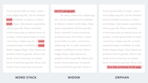
Word stacks happen when consecutive rows of text start or end with the same word. They make the writing seem repetitive.
“Widows” occur when the last line of a paragraph ends up at the top of the next page.
“Orphans” occur when the first line of a paragraph ends up at the bottom of the page.
Widows and orphans both break the reader’s train of thought. Avoid them.
How to Hire a Professional Typesetter
Many authors are concerned with how cheaply they can publish. There is nothing wrong with wanting to save money, but I would never do it at the expense of putting out a poor product with my name on it.
Unless you are confident that you can create a quality layout on your own without wasting a lot of valuable time, it’s worth hiring a professional typesetter.
How Much Does Professional Typesetting Cost?
The cost of professional typesetting can vary widely:
Low Quality: $0 – $500 (DIY software like Vellum is in the middle of this range)
Acceptable: $750 – $1,000
High Quality: $1,500
Best Possible: $2,500+
The main reason pro work is so expensive is that it’s complicated, and nobody wants to do it. Interior layout is tiring, and it requires a lot of hours from someone with a lot of training and experience.
Designers thrive on fun, creative projects. When they think about their dream gigs, typesetting isn’t what most of them have in mind. It demands a lot of precision and “boring” practical considerations that designers don’t always want to deal with.
Typesetters are able to move slowly and charge a lot because there aren’t many of them out there. If time and money are not a consideration, and you just want someone who will do a great job, the professionals at the top level do excellent work.
If time and money do matter, here’s some reassurance:
Book interior really only matters when you get it wrong.
No one notices when you get it right (unless it’s an unusually amazing or complicated design), so you don’t necessarily need to go for the most expensive designer. You just need to get it “not wrong.”
Where to Find Professional Typesetters
Find a firm that specializes in typesetting and interior layout design. The designers should have good reviews and samples of past work to show you.
Be careful, though. Sometimes professional companies outsource the design to cheaper, overseas typesetters. You might be paying for more than you’re getting.
If you want a package deal that includes typesetting, cover design, editing, distribution, and marketing guidance, Scribe offers a Guided Author Program for only $15k.
How to Choose a Great Typesetter
Most typesetters have a portfolio that highlights different styles and layouts. Have them send you a pdf file showcasing their work.
This will give you a good idea of the types of books they’re comfortable designing, how clean their layouts are, and what design options are open to you.
You’re probably hiring a book designer because you aren’t a pro. That means you may not know what technical questions to ask. And you may not pick up on tiny design elements like kerning or trim size.
So how do you know whether you’re getting a good or bad design?
Even though you aren’t a design pro, you know what it’s like to read a book.
Read through designers’ samples like you’d read through a normal book.
Could you read it quickly and easily? Were there spots where you slowed down? Did you have to zoom in because the font was too small?
Remember, a good layout is almost invisible. If your attention is constantly called to it, your readers’ will be too.