There is only one hard and fast rule in writing:
Do what works for you.
That’s it.
That being said, after decades of writing professionally and helping write and publish thousands of books, I have seen some lessons that hold true across lots of different people.
Here’s one: templates are more trouble than they’re worth, and writers don’t need to use them.
When it comes to self-publishing, Authors often use book templates because they think templates will make it easier to create a clean and well-designed book.
Nope. Books that stick to templates are often plagued by design flaws. Authors have to go back and fix lots of small formatting mistakes. They spend more time correcting the template’s errors than if they’d done everything manually from the outset.
In this post, I’ll explain what the term “book template” usually refers to and what their different limitations are. Then we’ll explain what you should use instead.
What Is a Book Template?
When people Google “book template,” they are usually thinking of two different things:
- A manuscript template: This helps writers format their written work so it looks professional before they send it to editors. The emphasis is on clarity and readability, not nice visual design. Think of a Microsoft Word document versus a printed book. Finished books need to be visually appealing, but manuscripts are basic.
- A book layout template: This involves figuring out book design elements like font, image sizes, and the placement of chapter headings, page numbers, and graphics. Think of something you create in Adobe InDesign versus something you jot down in Microsoft Word.
These two documents are radically different. They won’t look anything alike.
They aren’t supposed to because the two documents have different purposes, and you should not confuse them.
Manuscript Formatting vs. Interior Layout Formatting
Manuscript Formatting
A manuscript is a finished, book. It’s the actual Microsoft Word (or Google Docs) file that contains your book.
Its purpose is to give editors a clear and consistent document that’s easy to read. When an editor reads a manuscript, they want it basic so they can focus on the quality of the writing.
Manuscript formatting is pretty basic. Most of the conventions will seem obvious: use a standard font like Times New Roman, use black text on a white background, set the paper size to 8.5″x11″ (Check out this post on Scribe’s 15 manuscript formatting rules for a full list).
Most of these rules are baked into the defaults of Microsoft Word or Google Docs. If you don’t touch the settings on your word processing program, you are fine.
So why do we mention them? Because every one of these is routinely violated by authors who don’t pay attention.
No matter how tedious or silly it may seem, don’t ignore the proper manuscript format for writing a book.
You might be wondering, why does all this little stuff matter?
When editors receive badly formatted manuscripts, they spend their time fixing the formatting instead of your writing. That means you’re paying them to make edits that don’t really improve your book. Plus, it just looks unprofessional.
Here’s the good news. Standard formatting is easy. Once you learn it, you won’t have to worry about it again.
Interior Layout Formatting
Printed books (and even eBooks) look really different from a manuscript document. They have different fonts. The words are aligned differently. The images are precisely placed on the page.
All that formatting is also known as typesetting.
A typesetter’s job is to put text on a page so it’s print-ready. They are in charge of deciding what fonts to use, how to format chapter headings, how large the margins should be, where images should go, and so on.
Basically, they make pages look good for readers.
That might seem simple. After all, it’s just words on a page. Microsoft Word formats text automatically. What’s the big deal, right?
Actually, it’s one of the hardest things to do in design.
If you use the wrong font, readers can get headaches. Literally.
If your paragraphs are poorly spaced, readers won’t lose themselves in the flow of the book.
All these little things have a huge impact on how much a reader enjoys your books. There’s more to it than you might think.
A book with a good interior layout will look lightyears better than anything you can design with a Microsoft Word template. The differences may be subtle to the untrained eye, but they matter a lot to readers.
When it comes to typesetting, the difference between professional and amateur books is clear.
Some Major Differences Between the Two Formats
When you’re designing the interior layout of most nonfiction books, there will be special elements to consider. Charts, graphs, images, and sidebars all have to be inserted on specific pages in specific places. Your book cover has to be the right resolution and size.
You don’t have to worry about all that in a manuscript. Even if you include images or notes, they won’t look the way they will in the later layout phase.
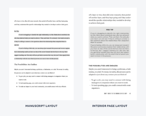
Here’s an example of a manuscript layout versus an interior page layout from James Carbury’s book Content-Based Networking: How to Instantly Connect with Anyone You Want to Know:
A word of warning: When you’re writing a manuscript, you might be tempted to include fancy features like sidebars, graphics, and callouts. They are easy to add in the writing phase, but they become trickier once you’re designing the inside pages of your book.
Try to minimize special layout styles if you can. If you have too many complicated design elements, you will spend a fortune on layout work and book printing. It’s best to keep the book layout simple.
Why You Should Avoid Using a Book Template
This is important:
We don’t recommend using a template for either manuscripts or interior layouts.
For a manuscript, book writing templates may be helpful when it comes to basic formatting, but every book has structural differences. The parts of a business book are going to be very different from those of a memoir.
Will you have a preface or a foreword? How many chapters will you have? What are the typical conventions for back matter or citations in your field?
Typically, templates aren’t flexible enough to account for these kinds of differences between manuscripts. You will need to customize it so much, in the end, it won’t be that useful.
For interior layouts, templates are even worse. Every book has unique typesetting issues that templates won’t address.
Unless you feel supremely comfortable evaluating how the template addressed crucial questions like book size, widows (a real thing in books), orphans (also a real thing in books), and word blocks, you shouldn’t trust that it did everything correctly. (All those elements are addressed in this post on typesetting.)
If you do feel supremely comfortable with those things, you probably don’t need a template in the first place.
If you use a template, you’ll still end up correcting every page for mistakes. Or, in the worst-case scenario, you’ll have a cheap layout that makes your book (and you) seem unprofessional.
When you use a free template, you usually get what you pay for.
What You Should Use Instead
For a Manuscript
Here’s the great news: the only software you need to write a book is already on your computer.
Word processors are pretty much the same, so pick the one you know best.
Google Docs is my preference because it makes collaboration easy. But you might prefer Pages or Microsoft Word.
They’ll all get the job done as long as you’re familiar and comfortable with your choice.
Instead of a template, we recommend relying on the presets of your software, built-in styles (more on that in a moment), and these additional guidelines.
When you start a new book, it’s a good idea to use proper formatting right away. If you try to format your writing after the fact, you will miss small errors.
A Word on Styles
Titles and chapter headings need to stand out. The way to do that is to use a bigger font or make the text bold.
Seems easy. But there’s a right way and a wrong way to do it.
The wrong way is to do it manually every time. This means changing the font size, underlining something, or italicizing something every time you need to. Even if everything looks right, there are still probably going to be some inconsistencies.
Let’s say you’re writing a book with 10 chapters and each has 3-4 subsections. You would have to remember the exact combination of font size or boldness you used for every single section. Sidebars might have another font size or style, while captions for graphics have another altogether.
Manual formatting means you will have a lot of errors.
Plus, when you’re ready to format the interior layout later on, inconsistencies make formatting more complicated.
The correct way to format a manuscript is to use the “style function.” This associates the correct heading (H1, H2, H3, etc.) with specific parts of your book. For example, chapter titles might always be H1, while subsections are formatted in H2.
Styles make everything consistent and easier for the interior designer. And in the end, it ensures your book looks the way you want.
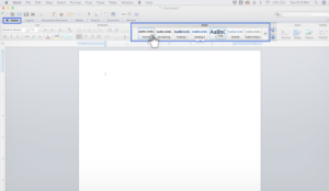
Here’s how to use the style function in Word:
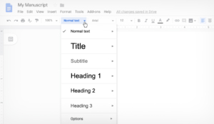
Here’s how to use the style function in Google Docs:
For Interior Layout Design
For almost every step in the book publishing process, you have two options: do it yourself or hire a professional to do it for you.
If you go the DIY route, it’s better to use typesetting software, which offers more flexibility with your layouts. Microsoft Word templates won’t look good on the printed page.
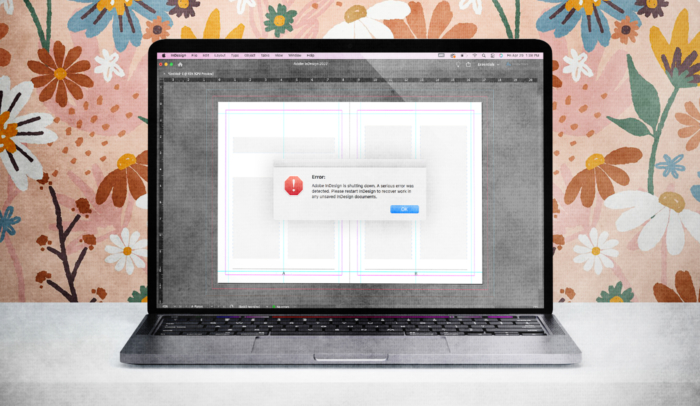
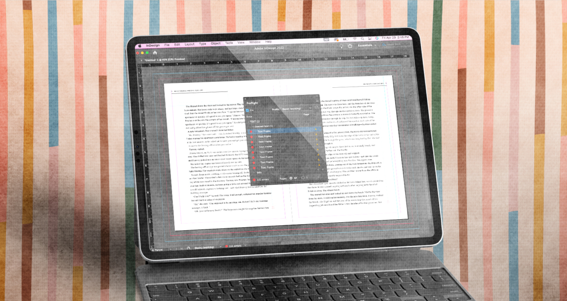
If you really want to go all out, you need to learn Adobe InDesign, along with the basics of typography and design.
To be clear: Don’t do that.
Instead, try Vellum. It’s an application that lets users easily design print and eBook layouts. It’s only available on Mac, and you will have to pay for it, but it’s the best thing out there if you want to typeset on your own.
The result is only so-so, but it’s still better than hiring a cheap designer.
For more tips on Vellum, check out this lesson on Scribe Book School.
Remember, good typesetting is time-intensive. Even if you use Vellum, there’s no shortcut for a great layout.
Plus, the more special features your book has, the easier it’s going to be to make mistakes. If your book has lots of images, sidebars, or lists, the typesetting will be much more involved.
If you can afford it, your best option is hiring a professional designer.